You are using an out of date browser. It may not display this website correctly.
You should update it or use a new browser.
You should update it or use a new browser.
Pawn Tactics Redesign / Tournament Introduction
- Thread starter Alex
- Start date
I was seeing some mixed reactions to the new design, not to worry, the design is in its infancy and will be improved over time. On top of that, we can always provide the old style as an alternative if there's enough support to keep it around!
If you all could be a little understanding that’d be great. Pingpawn and Alex took out a lot of time working on this and it looks great. Keep in mind that this was rushed and it will be enhanced. The dislike is probably because of being used to blue for so long.
Don’t throw away all their hard work with mean comments, please.
Don’t throw away all their hard work with mean comments, please.
second tourney**The first tournament of the new Website will be underway shortly!
And to introduce it we have @Pingpawn 's re-design of PT's Lobby!
Thank you for everyone's hard work in making this tournament!
Good luck to all the contestants!
- Tournament Directors, Staff, and GFX Team
shizangle
Graphics Crew
@everyone Constructive feedback is greatly appreciated
If you have a concern with something feel free to voice it appropriately.
Recommendations are always considered for any change that is being made.
Future plans (lobby)
1.) make scrollbars pixel perfect & smooth (they are confusing as hell)
2.) make less strain on the eyes from white accents/certain bright areas
3.) find the right text colors
4.) provide better spacing/alignment between lobby panels
Future plans (Respawn Menu)
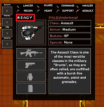
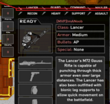
1.) fix the hitboxes for the top row of the classes
2.) make the class tabs a different shade so they are more visible buttons
Future plans (HUD - In-game)
1.) Still in conceptual phase. I will be taking recommendations if any of you have them.
Huge shoutout to @ImANoob for working extremely hard with me to provide fresh content for the optimists in the community.
cheers
I think it looks great  Thanks
@everyone Constructive feedback is greatly appreciated
If you have a concern with something feel free to voice it appropriately.
Recommendations are always considered for any change that is being made.
Future plans (lobby)
1.) make scrollbars pixel perfect & smooth (they are confusing as hell)
2.) make less strain on the eyes from white accents/certain bright areas
3.) find the right text colors
4.) provide better spacing/alignment between lobby panels
Future plans (Respawn Menu)
1.) fix the hitboxes for the top row of the classes
2.) make the class tabs a different shade so they are more visible buttons
Future plans (HUD - In-game)
1.) Still in conceptual phase. I will be taking recommendations if any of you have them.
Huge shoutout to @ImANoob for working extremely hard with me to provide fresh content for the optimists in the community.
cheers

You should also consider changing the "Ready"-button. It's not intuitive (it took me a minute to find it and several people were confused about it too).
It should be a different color to indicate it's clickable. Design itself is good imo.
It’s the first. It was planned before(most likely) and announced before. It’s also a TD tournament. Not to hate on the other one of course, that ones great too.second tourney**
I didn't notice this thread, but I made a thread of my own for anyone who has constructive criticism. Not that you can't post here, but future plans are coming, regardless. Use this thread to post feedback on updates and bugs.
I just realized there is no lobby 8...
How can you take away the institution of what lobby 8 represents
How can you take away the institution of what lobby 8 represents
It’s the first. It was planned before(most likely) and announced before. It’s also a TD tournament. Not to hate on the other one of course, that ones great too.
It was the first TD tournament, 7's was the first tournament

